A high-converting homepage does one thing above all else: it answers three questions within seconds of a visitor landing on it. What do you offer? Who is it for? What should I do next? When those answers are visible, clear, and trustworthy, visitors stay. When they’re buried or vague, they leave. According to a Forrester Research analysis, a well-designed user interface can lift a website’s conversion rate by up to 200%, and a fully optimized user experience can push that improvement to 400%.
Most homepages fail not because they lack effort, but because they confuse effort with clarity. They add more sections, more features, more copy, more colors, and in doing so, dilute the very message that was supposed to convert. This article breaks down every layer of a high-performing homepage, backed by research and real data.
1- The Hero Section Does More Heavy Lifting Than Any Other Element
Nielsen Norman Group research confirms that users spend 80% of their viewing time on content above the fold. That single stat should reshape how you think about your homepage. The hero section isn’t just a design choice. It’s the most commercially productive real estate on your website.
The hero needs to pass what UX practitioners call the “five-second test”: a visitor should understand exactly what you do and why it matters within five seconds of landing on the page. That means your headline should lead with benefit, not branding.
What a strong hero section includes:
- A benefit-driven headline
- A subheadline that expands on the offer or addresses a specific pain point
- A single, visible call-to-action above the fold
- A supporting visual: product screenshot, lifestyle image, or short demo video
- No navigation clutter or competing messages
Data from split tests confirms that benefit-driven headlines outperform feature-focused ones by an average of 31% in conversions. The difference between “We Build Custom Software” and “Ship Your Product 2x Faster With a Dedicated Dev Team” is the difference between a bounce and a click.
2- Your Value Proposition Has to Be Specific Enough to Be Believed
“The consumer isn’t a moron; she is your wife.” (David Ogilvy)
People scan homepages with skepticism baked in. Vague claims like “world-class solutions” or “innovative platform” signal nothing and register as noise. A genuine value proposition answers the question: “Why should I choose you over the alternative?” It should be grounded in specifics.
| Weak Value Proposition | Strong Value Proposition |
| “We help businesses grow.” | “We’ve helped 400+ SaaS companies cut churn by 30% in 90 days.” |
| “Powerful email marketing software.” | “Send smarter campaigns. Our users average a 42% open rate.” |
| “Your trusted financial partner.” | “No hidden fees. No minimums. Open an account in 4 minutes.” |
The specificity is the proof. Numbers, timeframes, and outcomes make claims credible without needing external validation. When you pair a sharp value proposition with a focused CTA, landing pages with a single call-to-action can boost conversion rates by up to 371% compared to pages with multiple competing options.
3- The Navigation Bar Is a Conversion Tool, Not a Sitemap
Most brands treat the top navigation as an exhaustive directory of every page on their site. That’s a mistake. An obvious navigation menu with standard labels like “About,” “Products,” and “Contact” follows familiar patterns users expect, since visitors spend most of their time on other websites and expect yours to behave predictably.
A homepage navigation should have no more than five to six items. Every extra link is a decision point, and decision fatigue hurts conversions. The primary CTA, whether that’s “Get a Demo,” “Start Free Trial,” or “Get a Quote,” belongs in the navigation bar as a button, not a text link. It should contrast visually from everything else.
Keep the nav sticky on scroll. As users move down the page and their intent grows, the CTA should remain accessible without requiring them to scroll back up.
4- Social Proof Is the Closest Thing to a Conversion Guarantee
92% of consumers trust recommendations from people they know over any form of advertising, and 95% read reviews before buying. Your homepage needs to address this before a visitor ever reaches your CTA.
Research indicates that 3 to 5 testimonials on the homepage strikes the optimal balance between credibility and cognitive load, and having 100 or more testimonials in your overall library correlates with 37% higher conversions. Social proof appears in several forms, ranked by impact:
- Video testimonials: Video format testimonials increase conversion rates by 80% over standard written reviews. The visual and emotional connection creates stronger trust signals than text alone.
- Client logo walls: Recognition by association. Logos from known brands signal credibility without requiring the visitor to read anything.
- Aggregate ratings: Star ratings and review count visible near the hero section reduce skepticism at the point of highest attention.
- Case studies with outcomes: Specific numbers (“Increased revenue by $240K in Q1”) convert better than generic praise (“Great company to work with”).
- Third-party certifications and badges: Security badges, industry awards, and press mentions all serve as external validators.
Placement matters as much as the element itself. Your homepage needs your star rating, three testimonials, and a logo wall visible without scrolling. Put them right where the decision is being made, not below the fold.
5- Page Speed Is Not a Technical Detail, It’s a Revenue Issue
According to Google, users are 32% more likely to bounce if your page takes longer than 3 seconds to load. Desktop still outperforms mobile in conversions at approximately 4.8% versus 2.9% on mobile. That gap exists largely because of poor mobile UX and slow load times on handheld devices. Closing it starts with the homepage.
The main speed culprits on homepages:
- Uncompressed hero images (switch to WebP format)
- Render-blocking scripts loaded before content
- Autoplay video in the hero section
- Excessive third-party tracking scripts
- No lazy loading on below-the-fold content
A one-second delay in page response can reduce conversions by 7%, according to an Akamai study. For a site doing $50,000 a month in revenue, a one-second lag could cost $42,000 annually. That’s not a rounding error.
6- The CTA Architecture Across the Page
A single CTA in the hero section isn’t enough. Visitors scroll at different depths and arrive with different levels of intent. A first-time visitor reading about your features needs a CTA at the bottom of that section. Someone who reached your pricing comparison needs one there too.
Place a CTA wherever a visitor might be ready to convert. That typically means:
- In the hero section (primary CTA)
- After the value proposition or features block
- Directly following testimonials or case studies
- In the footer or sticky navigation
Use first-person phrasing. “Start My Free Trial” converts better than “Start Your Free Trial.” Behavioral economics research shows that multiple conflicting CTAs can decrease conversion rates by up to 266%. When visitors have too much to choose from, they often choose nothing. One primary action. Supporting secondary options. Never equal weight on both.
7- The Features Section Should Sell Outcomes, Not Functions
Most homepages describe what their product does. The best ones show what changes for the customer because of it. There’s a difference between “Automated reporting dashboard” and “Know your numbers without touching a spreadsheet.”
Use a three-column or two-column layout to present features with icons or illustrations. Each feature should follow a simple pattern: name, one-sentence benefit, optional supporting detail. Keep it scannable. Visitors don’t read feature lists; they scan for the one thing that matters to them.
If your product is complex, use a short demo video or animated GIF in this section. Including videos on landing pages can increase conversion rates by up to 80%. A 60-second product walkthrough tells a story that 400 words of copy cannot.
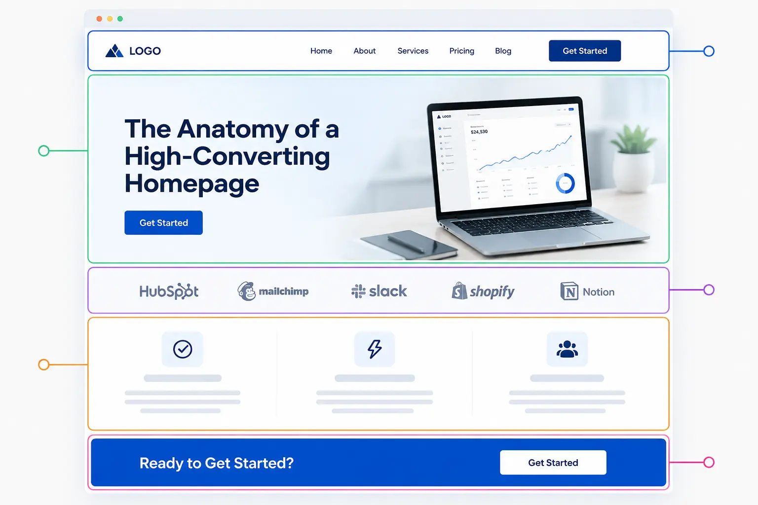
8- What a Homepage Conversion Framework Looks Like
Here’s how the sections stack in a high-converting homepage, from top to bottom:
| Section | Purpose | Conversion Role |
| Navigation bar | Wayfinding + primary CTA | Accessibility |
| Hero | Communicate core offer | Capture attention, initiate intent |
| Social proof strip | Logo wall or aggregate rating | Immediate credibility |
| Value proposition | Specific, outcome-driven promise | Establish differentiation |
| Features / Benefits | Show how the product works | Reduce doubt |
| Case study or testimonials | Detailed proof | Build trust, overcome objections |
| Pricing or process overview | Set expectations | Reduce friction |
| Secondary CTA | Final conversion prompt | Capture undecided visitors |
| Footer | Navigation, contact, links | Utility |
Every section should do visible work. If a section can be removed without the page losing anything, it probably should be.
Frequently Asked Questions
What is the most important element of a high-converting homepage?
The hero section combined with the value proposition carries the most conversion weight. If visitors don’t understand what you offer and why it matters within five seconds of landing, the rest of the page doesn’t matter.
How many CTAs should a homepage have?
One primary CTA repeated in strategic positions: hero, mid-page, and near the footer. Secondary CTAs (like “Learn More” or “Watch Demo”) can exist but should never compete visually with the primary action.
Does page speed really affect homepage conversions?
Yes, significantly. A three-second or longer load time increases bounce probability by 32% according to Google’s own data. Speed is not a backend concern; it directly affects how many visitors ever see your conversion elements.
How much social proof is enough on a homepage?
Research points to three to five testimonials as the sweet spot. Quality and specificity matter more than volume. A testimonial with a real name, photo, and specific outcome outperforms a wall of generic five-star reviews.
Should the homepage target all visitors or a specific audience?
Your homepage should speak clearly to your primary buyer persona while not confusing secondary audiences. If you serve multiple distinct markets, use the navigation and CTAs to segment them early rather than trying to say everything to everyone.
What makes a homepage CTA effective?
First-person phrasing, high color contrast against the background, specific action language (not “Submit” or “Click Here”), and placement immediately following a persuasive element: a testimonial, a benefit statement, or a key statistic.
How often should a homepage be updated or tested?
Run A/B tests on headline copy, CTA text, and hero visuals on a rolling basis. Review layout performance quarterly. Any time your offer, pricing, or audience positioning changes, the homepage should reflect that shift immediately.