

Improving your website conversion rate comes down to a short list of proven moves. Make your calls to action impossible to miss, cut friction out of your forms, speed up your pages, show real social proof, and test every change before rolling it out. Sites that follow these steps turn a larger share of the same traffic into leads and sales without spending another dollar on ads.
This guide explains what a conversion rate is, what a good one looks like for your industry, and the exact tactics that lift it. Each tip applies to service businesses, ecommerce stores, and lead generation sites alike. Most of them can be put to work this week.
Key Takeaways
- A website conversion rate measures the percentage of visitors who complete a goal such as a purchase, a booked call, or a submitted form.
- Most websites convert in the low single digits, and the benchmark table below shows where your industry tends to land.
- Clear calls to action, short forms, fast pages, and visible social proof deliver the biggest gains for the least effort.
- A/B testing protects you from confident redesigns that quietly lower conversions.
- Landing pages built around one message and one goal outperform cluttered pages every time.
What Is a Website Conversion Rate?
A website conversion rate is the percentage of visitors who complete a desired action on your site. That action can be a purchase, a quote request, a phone call, an email signup, or a downloaded guide. The formula stays the same in every case. Divide total conversions by total visitors, then multiply by 100.
Picture a plumbing company site that draws 2,000 visitors in a month and receives 60 quote requests. Its conversion rate is 3%. The same math applies to an online store tracking purchases and to a software product tracking trial signups.
Traffic on its own pays no bills. Conversion rate tells you how well your site turns attention into revenue, which makes it one of the few marketing metrics tied directly to income. Raising it has the same effect as buying more traffic, at a fraction of the cost.
The chart below makes the math visual. Each single point of improvement adds a meaningful stack of new leads from the exact same audience.
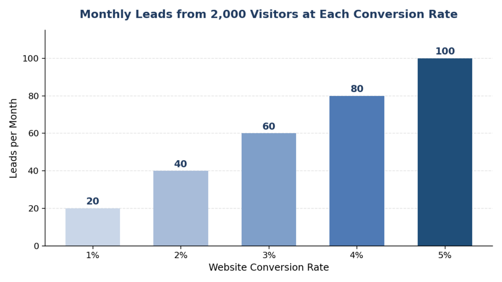
Each percentage point of conversion rate adds 20 leads per month for a site with 2,000 visitors.
What Counts as a Good Conversion Rate?
The average conversion rate across industries falls between 2% and 5%, according to benchmark data published by OptinMonster. The best performing sites push well past that range, and the weakest sit under 1%. Your own number depends on your industry, your traffic sources, your price point, and what you count as a conversion.
Context changes everything. A landing page that only asks for an email address should convert at a far higher rate than a checkout page asking for a credit card. The table below shows where different segments tend to land.
| Segment | Typical Range | What It Tells You |
|---|---|---|
| All industries combined | 2% to 5% | A healthy baseline for most websites |
| Ecommerce stores | 1.5% to 3% | Price comparisons and cart abandonment keep this range lower |
| B2B lead generation | 2% to 5% | Longer sales cycles keep the number modest |
| Lead capture landing pages | 10% and above | Asking for an email converts far better than asking for money |
| Paid search traffic | 3% to 6% | High intent visitors convert above site averages |
| Cold social media traffic | 0.5% to 1.5% | Low intent traffic needs retargeting before it converts |
Compare your site against its own history first and your industry second. A business that moves from 1.2% to 2% has grown its leads by two thirds, no matter what any benchmark says. Steady month-over-month improvement beats chasing someone else’s number.
How to Improve Your Website Conversion Rate
Every tactic below attacks one of three problems. Visitors fail to understand the offer, they hit friction on the way to converting, and they hesitate to trust you. Fix all three and the rate climbs.
1. Strengthen Your Calls to Action
A vague button label kills action. “Submit” tells visitors nothing about what happens next, and “Learn More” promises them homework. Swap in outcome-driven labels like “Get My Free Quote” and “Start My Free Trial” so the value sits right on the button.
Placement matters as much as wording. Keep one primary call to action above the fold, repeat it after each major section, and give it a color that stands apart from everything around it. One page, one goal, one dominant button.
2. Rewrite Headlines Around Customer Pain Points
Your headline is the first thing visitors read and your last chance to stop them from leaving. Lead with the problem your customer feels, not the service you sell. “Stop Losing Weekend Calls to Voicemail” pulls far harder than “Professional Answering Services” since it names the pain out loud.
Write ten versions before picking one. Put the strongest two head to head and keep the winner. Headlines built around pain points and outcomes routinely beat clever wordplay, and they give the rest of the page a clear promise to deliver on.
3. Simplify Your Forms
Every extra form field costs you completions. Ask for a name, an email, and a phone number, then gather everything else during the follow-up conversation. Long forms filter out busy people who would have made excellent customers.
Mark required fields clearly, show error messages next to the field they describe, and size every input for thumbs on a phone screen. Small usability fixes on forms routinely outperform expensive redesigns elsewhere on the site.
4. Speed Up Your Website
Akamai research found that a one-second delay in page load time can reduce conversions by 7%. Slow pages bleed money before visitors ever read a word. Compress your images, cache aggressively, and remove scripts the site no longer needs.
Test your speed on a mid-range phone over mobile data instead of an office desktop with fiber. That slower experience is the one most of your visitors actually get, and it is the one that decides your numbers.
5. Add Social Proof Where Decisions Happen
People copy other people. Reviews, testimonials, case studies, client logos, and star ratings all lower the perceived risk of saying yes. Place them next to the decision point, near your pricing, your forms, and your checkout, instead of burying them on a separate page nobody visits.
Specific proof beats generic praise. A testimonial that names a result—such as a kitchen remodel finished two weeks ahead of schedule—carries far more weight than a five-star rating with no story behind it. Recency counts too, so keep fresh reviews flowing in.
6. Polish the Mobile Experience
Most buying journeys now start on a phone, so a desktop-first site quietly turns those visitors away. Buttons need to be thumb-sized, text needs to be readable without zooming, and menus need to collapse cleanly.
Click-to-call buttons deserve special attention from service businesses. A visitor who can tap once to reach you converts on the spot. The same visitor forced to copy a number into a dialer often gives up and calls a competitor instead.
7. Speak to Your Ideal Customer
Copy that tries to talk to everyone ends up moving no one. Build a clear picture of your best customer, the questions they ask, the words they use, and the objections that hold them back. Then write your pages in that exact language. Visitors convert when a page sounds like it was written just for them.
Traffic quality follows the same logic. Someone searching for a service in their own town sits far closer to buying than someone who wandered in from a viral post. Bergen County businesses see this pattern every day, and it is the reason our local SEO services for Wyckoff businesses center on ranking for searches with clear buying intent. Better traffic quality lifts your conversion rate before you touch a single pixel of design.
8. Use Heatmaps to Study User Behavior
Analytics show you where visitors drop off. Visual behavior tools show you why. Heatmaps reveal where people click, scroll maps show where they stop reading, and session recordings replay real visits so you can watch someone struggle with your form in real time.
Tools like Hotjar and Microsoft Clarity make this data cheap and painless to collect. A single afternoon spent watching recordings usually surfaces two to three friction points nobody on the team knew existed, from dead clicks on images that look like buttons to menus that trap people on phones.
9. Turn User Data Into Page Improvements
Behavior data only pays off once it changes the page. Convert each finding into a specific fix: a shorter form where recordings show abandonment; a clearer button where the heatmap shows dead clicks; a rewritten section where the scroll map shows readers stalling.
Rank the fixes by expected impact and effort. Ship the cheap, high-impact ones right away and queue the bigger ones for testing. Review your numbers after every change so the loop of observing, fixing, and measuring keeps running.
10. Run A/B Tests Before Committing to Changes
An A/B test shows two versions of a page to different halves of your traffic and measures which one converts better. Change one element at a time, such as a headline, a button label, and a hero image, so you know exactly what moved the needle. Let each test run until enough visitors have passed through for the result to mean something.
Management writer Peter Drucker put it plainly. “What gets measured gets managed.” Testing turns conversion work from guessing into a system, and it protects you from confident changes that quietly hurt results.
What Are Some Quick Wins for Boosting Conversions?
A full CRO program runs for months. The moves below take a day each and still push the number in the right direction.
- Swap generic button labels for outcome-driven ones like “Get My Free Quote”
- Cut every form field you can live without
- Compress your five heaviest images to bring load times down
- Add three recent reviews next to your main call to action
- Put a click-to-call button in your mobile header
- Strip menu links off dedicated landing pages so the only path forward is the goal
- Fix broken links and dead buttons surfaced by a quick site crawl
Every item on this list can be done without a designer and without new budget. Roll them out this week, measure for two weeks, and keep whatever moved the number.
The Qualities of a Landing Page That Converts
A strong landing page holds one message, one audience, and one goal. The headline mirrors the ad, the search result, and the email that brought the visitor there, so nobody wonders if they clicked the wrong link. Anything on the page that fails to move the visitor toward the goal gets cut.
- A headline that states the outcome the visitor wants
- One clear call to action repeated down the page
- Proof elements such as reviews, results, and trust badges
- Fast load times on ordinary mobile connections
- Short copy blocks with generous white space
The same principles govern your homepage, which acts as a landing page for every brand search. Our full breakdown of the anatomy of a high-converting homepage walks through each section in detail, from the hero area down to the footer.
Treat every high-traffic page this way. Product pages, service pages, and pricing pages all carry a conversion job, and each one deserves the same clarity you would give a paid landing page.
Turn More of Your Traffic Into Customers
H Grant Designs builds websites and landing pages engineered around the tactics in this article, with clear calls to action, fast load times, social proof placed where it counts, and testing baked into the process. If your site draws steady traffic yet the phone stays quiet, a conversion review will show you where visitors drop off. Reach out through our contact page and tell us what you want your website to achieve.
Frequently Asked Questions
What is a good conversion rate for a website?
Most websites land between 2% and 5%. Anything above 5% puts you ahead of the pack, and anything under 1.5% usually points to a targeting problem, a trust issue, or friction somewhere on the page.
How do I increase my website conversion rate?
Start with the changes that touch every visitor. Clarify your main call to action, shorten your forms, speed up your pages, and add reviews near decision points. Then run A/B tests to confirm each change actually helped.
How is website conversion rate calculated?
Divide the number of conversions by the number of visitors, then multiply by 100. A site with 1,000 visitors and 30 completed goals converts at 3%. Track the number monthly so trends show up early.
Why is my website conversion rate so low?
The usual culprits are slow load times, vague calls to action, long forms, missing social proof, and traffic that never wanted your offer in the first place. Fix the on-page basics first. Then look hard at where your visitors come from.
What does CRO mean in digital marketing?
CRO stands for conversion rate optimization, the practice of raising the percentage of visitors who take action on your site. It relies on research, user behavior data, and controlled testing instead of guesswork.