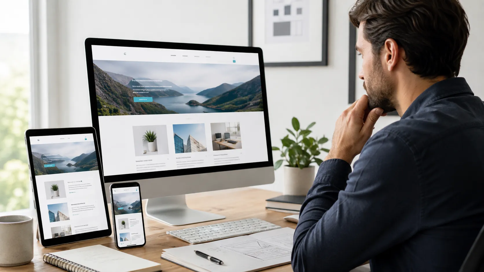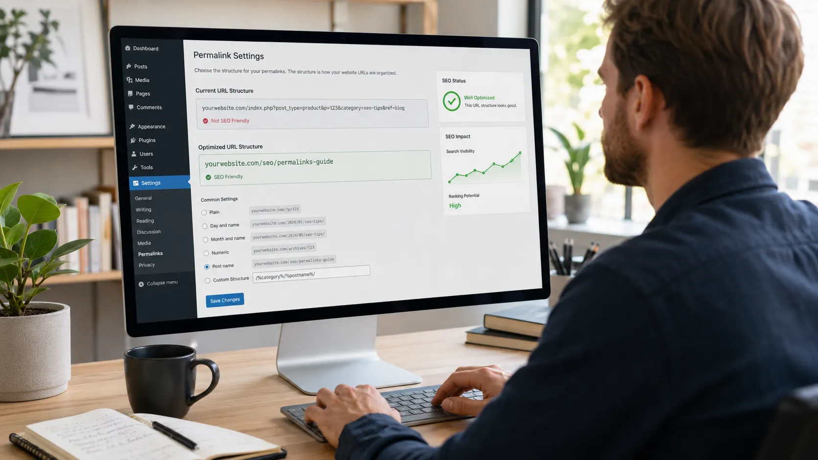

Whitespace and minimalism outperform cluttered layouts by cutting the mental work a visitor does before taking action. A page with fewer competing elements guides the eye toward one job instead of ten, and that single point of focus is what turns a browsing visitor into a lead, a booking, or a sale. Business owners often assume more content and more graphics add value for the reader. Real user data tends to say the opposite once a page gets tested against a simpler version of itself.
Key Takeaways
- Cutting visual clutter lowers the mental effort a visitor spends before clicking.
- Whitespace works as an active design tool that groups and separates content, not as a gap to fill.
- A documented case study tied a whitespace change to a 33 percent jump in completed purchases.
- Minimalism can backfire if it strips out the proof points that build trust.
- Mobile visitors reward a page that gets to the point fast, and most local searches happen on a phone.
What Whitespace and Minimalism Actually Mean on a Web Page
Whitespace is the open space around and between elements on a page, not a leftover gap that needs filling. Designers split it into two working types. Micro whitespace sits between lines of text, letters, and small components like icons and buttons. Macro whitespace is the larger space between sections, images, and blocks of content.
Minimalism is the broader design approach that whitespace serves. It strips a page down to the elements that earn their place—a clear headline, one strong image, a single call to action—and lets space do the rest of the work. A minimalist page is not a page with less content dumped onto it. It is a page built around one goal, with every color, font, and graphic chosen to support that goal instead of competing with it.
Both types of whitespace work together to group related items and separate unrelated ones. A pricing table crammed edge to edge reads like one dense block of numbers. Add breathing room around each tier and a visitor spots the plan built for them within seconds, no scanning required.
Why Less Design Often Performs Better
1. Pages Load Faster
A minimalist page carries fewer images, scripts, and design assets, so it renders sooner on both desktop and mobile connections.
- Fewer requests for images, fonts, and third-party scripts on each page load
- Smaller total page weight that loads faster on slower mobile connections
- Quicker time to first paint keeps a visitor from bouncing before the page even renders
2. Visitors Find What They Need
A page with a small number of clear choices helps a visitor reach a decision instead of stalling on which link to click first.
- One primary call to action per screen instead of five competing offers
- A clear visual hierarchy that guides the eye through headline, proof, and action in order
- Fewer menu items and links lower the chance of a visitor clicking the wrong thing
3. Brand Messages Stick
One focused message repeated with consistent spacing and color builds recognition faster than ten different messages fighting for the same glance.
- A consistent color palette across pages reinforces the brand instead of diluting it
- A single strong image outperforms a wall of stock photos competing for attention
- Repeating the same core message across a site strengthens memory across repeat visits
4. Mobile Screens Reward Simplicity
Small screens already limit how much a visitor can see at once, and a busy design multiplies that limitation instead of working around it.
- Generous spacing prevents mis-taps on buttons and links placed close together
- Simple layouts reflow cleanly across phone, tablet, and desktop screens
- Comprehension improves when text and images are not competing for the same cramped space
5. Sites Cost Less to Maintain
A smaller set of custom elements is simpler to update, test, and secure, which lowers the ongoing cost of running the site.
- Fewer plugins and custom scripts mean fewer security patches to track over time
- Updates roll out faster when there is a smaller set of templates and sections to test
- Future redesigns take less time since the structure is not cluttered with one-off elements
The Psychology of Why Fewer Elements Win
Human attention runs on a limited budget, and every extra button, banner, and pop-up spends part of it. A short list of psychology findings explains why a simpler page holds that attention better than a busy one.
- Hick’s Law, a long-standing finding in behavioral psychology, states that the time it takes someone to make a decision grows with the number of choices in front of them.
- Gestalt grouping means the eye reads items placed close together as one unit and items spaced apart as separate ideas, so spacing does the sorting automatically.
- Removing an element does not just clear space, it redistributes visual weight, so the elements left behind gain the attention the removed ones used to absorb.
Dieter Rams, the designer whose product work shaped Apple’s visual language, put it simply: “Good design is as little design as possible.” That thinking lines up with what usability testing keeps finding today. Strip a layout down to its core purpose, and the remaining elements gain visual weight, so the one action that matters actually gets noticed.
What Happens to Conversions When Clutter Gets Removed
A retail case study documented by the UX research team at UXPin tracked a product page after extra links around the Add to Cart button got replaced by open space. That single change lifted page engagement by roughly 20 percent, raised products added to cart by about 5 percent, and pushed completed purchases up by 33 percent. Numbers like that turn a simpler layout from a design preference into a business decision.
| Factor | Cluttered Layout | Minimalist Layout |
|---|---|---|
| Visitor decision time | Slows down as choices pile up | Stays fast with one clear action |
| Typical load speed | Weighed down by extra images and scripts | Lighter and quicker to render |
| Mobile readability | Cramped text and tight buttons | Generous spacing, easy tapping |
| Brand impression | Reads as busy and dated | Reads as confident and current |
This kind of clutter is rarely a design problem alone; it is usually a sign the site was built without a plan for what to prioritize. A WordPress web design team can rebuild that structure from the layout up instead of patching symptoms one element at a time.
Where Small Business Pages Lose Visitors to Clutter
Local business sites often add every service, every certification badge, and every past client logo to the homepage in one long scroll. Visitors bounce before they find the phone number and the contact form buried near the bottom. A landing page with three tight sections and one clear call to action can out-convert a ten-section page carrying twice the content.
Stock photography stacked three deep, oversized hero sliders, and auto-playing carousels compete for the same click from the same visitor. Trim those elements and the actual message—a location, a phone number, and a short service list get the attention it needs.
How Much White Space Is Too Much
Minimalism can tip into a design that feels empty, and a page that removes too much loses the context a visitor needs to trust it. Testing on smaller screens still favors generous spacing, and a recent design industry review found that added whitespace lifted reading comprehension by close to 20 percent on mobile layouts, where every pixel already competes for room.
A page stripped down to a logo and one button, with no proof points and no clear description of the service, asks a visitor to trust a stranger with nothing to go on. Balance sits in the middle with enough space to breathe and enough content to answer the visitor’s question.
Local business identity matters here as much as pure aesthetics. A landscaper still needs before and after photos, a plumber still needs license information visible, and a restaurant still needs its menu one click away. Minimalist design trims the noise around those things; it does not remove them.
Turning Minimalist Principles Into a Page That Converts
Applying minimalism to a real page comes down to a short set of repeatable habits.
- Cut any element that does not support the page’s single main goal.
- Group related content with space instead of boxes and heavy borders.
- Limit the color palette to two, maybe three, core tones plus one accent color for calls to action.
- Keep one primary call to action per screen instead of repeating five different offers.
- Test the page on a phone screen first, since that is where most local searches happen.
A homepage built around one clear goal tends to outperform one trying to do everything at once. Our guide on the anatomy of a high-converting homepage walks through how spacing and hierarchy work together on the page a visitor lands on first.
Ready for a Page That Actually Converts
A cluttered site rarely fixes itself with a new coat of paint. It usually needs a fresh look at layout, spacing, and which elements have earned their spot on the page. H Grant Designs builds and audits websites for Bergen County businesses with exactly that lens, trimming what slows a visitor down and keeping what moves them toward a call, a booking, or a sale. Get a free whitespace and layout audit to see where your current site loses visitors to clutter.
Frequently Asked Questions
What is whitespace in web design?
Whitespace is the open space around text, images, and buttons on a page. It includes small gaps between lines of text and larger gaps between full sections, and both work together to make a page easier to scan.
Does minimalist web design help SEO?
A simpler page tends to load faster, since it carries fewer images and scripts, and page speed is a known ranking factor. Faster, cleaner pages keep visitors around longer too, which sends a positive signal back to search engines.
Can a website have too much white space?
Yes. A page stripped down so far that it removes proof points, reviews, and clear descriptions leaves a visitor with too little to trust. The goal is balance, not an empty screen.
Is minimalist web design cheaper to build?
A simpler layout usually means fewer custom elements, faster development, and lighter maintenance. Costs still depend on project scope, but a cluttered site with dozens of custom sections almost always costs more to build and keep updated.
Does minimalism work for every type of business?
Most business types benefit from a cleaner layout and a clear path to one action. A business with a large, complex catalog may need more structure, but the same principles of grouping, spacing, and hierarchy still apply.